Low click-through rate on a strong video is one of the most demoralizing experiences in content creation. The content is good. The editing is clean. The title is optimized. Yet the video sits at 2% CTR while a competitor with half the production quality is pulling 8%.
The thumbnail made that difference. Not the algorithm, not the upload time. A viewer gave both videos the same two seconds and chose the other one.
YouTube thumbnail ideas that drive clicks are not creative accidents. They are built around specific psychological frameworks that exploit predictable patterns in human visual attention. This guide breaks down seven of them, with the psychology behind each one and how to apply it across any niche.
The Transformation Framework (Before vs. After)
The Transformation framework is the most reliable YouTube thumbnail ideas format for educational, fitness, finance, and lifestyle content because it makes the value of watching immediately visible. The viewer does not need to read the title or guess what the video delivers. The thumbnail shows the proof.
The psychological driver is aspiration combined with curiosity. A split screen showing a problem state on the left and a resolved state on the right creates an immediate question in the viewer's mind: how did that happen? The video is the only place that question gets answered.
1. The Split Screen
Divide the thumbnail canvas into two halves. The left side shows the problem, the messy desk, the empty bank account, the poor result. The right side shows the outcome. Color coding reinforces the contrast: darker, desaturated tones on the problem side and brighter, saturated tones on the solution side.
2. The Progress Journey
"Day 1 vs. Day 30" framing implies a documented transformation with receipts. It works because it signals that the creator has already done the work and captured the evidence, which makes the payoff feel guaranteed rather than promised.
3. The Glow Up
Aesthetic improvement thumbnails trigger aspiration without requiring text. A before and after that shows a visible quality upgrade, whether in a workspace, a physique, a design, or a skill output, communicates the video's value in a single glance.
| Framework Variation | Best Niche | Primary Trigger |
|---|---|---|
| Split Screen | Finance, Fitness, Coding | Curiosity and proof |
| Progress Journey | Health, Productivity | Aspiration and relatability |
| Glow Up | Design, Lifestyle, Beauty | Aspiration and desire |
The Extreme Emotion Framework
Human faces are the most attention-capturing element in any visual composition. The brain processes facial expressions before it processes text, color, or composition. That hardwired response is what makes the Extreme Emotion framework one of the most consistently effective thumbnail ideas for YouTube across every niche and audience type.
The mechanism behind it is mirror neurons. When a viewer sees a face expressing shock, disbelief, or intense focus, the brain instinctively mirrors that emotional state. That involuntary response creates an immediate psychological connection that stops the scroll before any conscious decision is made.
4. The 30% Face Rule
A face needs to occupy at least 30% of the thumbnail frame for micro-expressions to register at mobile scale. A small face in a busy composition loses all emotional impact when compressed to thumbnail size. Fill the frame. Crop tight. The expression is the message.
5. The Shocked Face
Overexaggerated surprise remains one of the highest-performing emotional expressions despite being widely used. The reason it still works is that genuine high-arousal emotion reads as authentic signal, not manipulation.
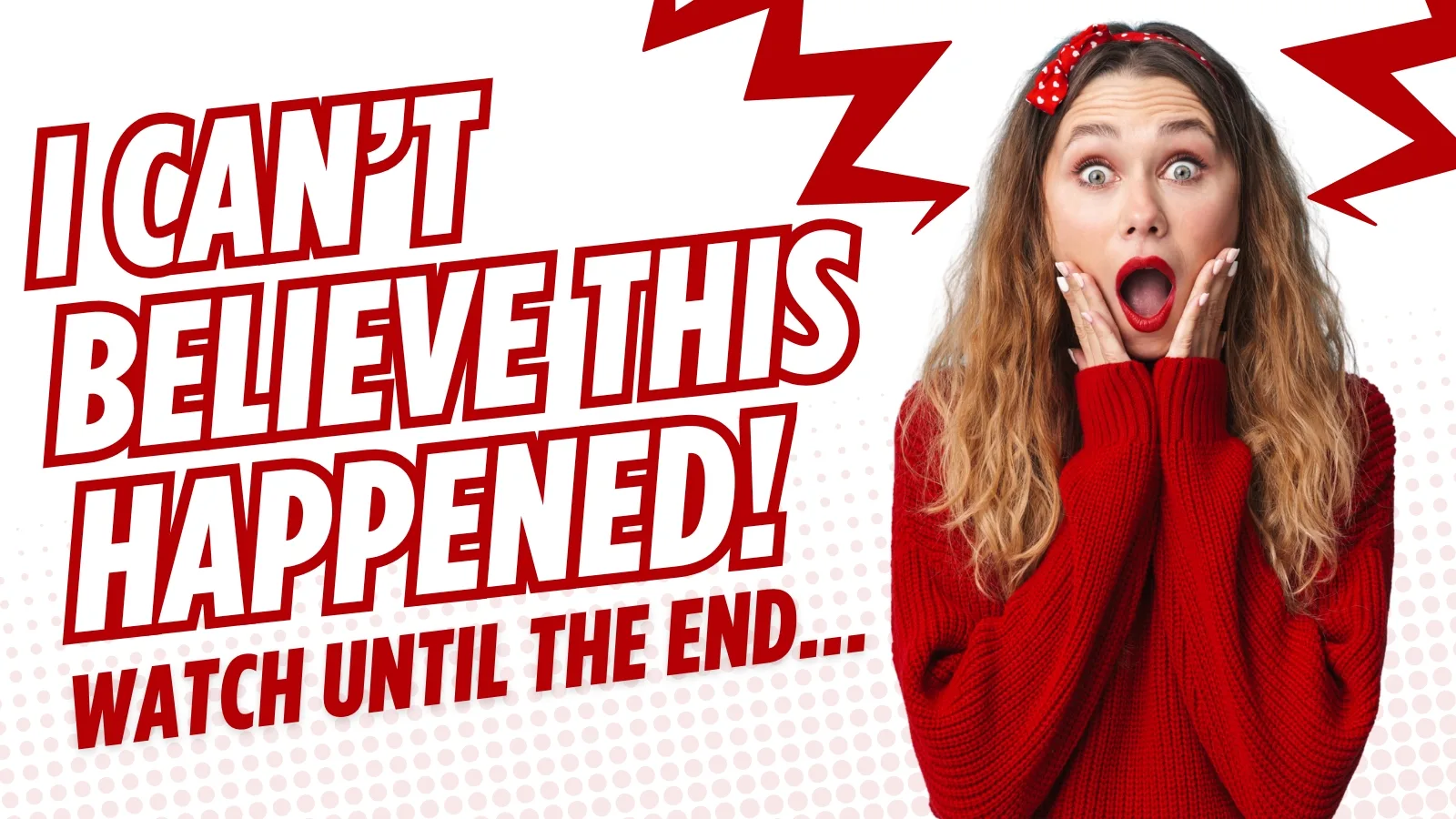
Viewers are not clicking because they believe the creator is shocked. They are clicking because the intensity of the expression signals that something genuinely unexpected is inside the video.
6. The Defeated Face
Vulnerability-driven expressions, disappointment, failure, and exhaustion, build empathy faster than any positive emotion. A creator looking genuinely defeated triggers the viewer's curiosity about what went wrong and their instinct to find out whether it gets resolved. These are among the strongest cool thumbnail ideas for channels built around personal finance, entrepreneurship, and self-improvement content.
7. Eye Contact and Gaze Direction
A subject looking directly at the camera creates an immediate sense of personal address. A subject looking toward a text element or an object in the frame directs the viewer's eye to that element automatically. Both techniques are intentional design decisions, and choosing the wrong one for the context costs attention that cannot be recovered at scroll speed.
The Comparison and Conflict Framework
Conflict is one of the most primitive attention triggers in human psychology. Two opposing elements placed in the same frame create an immediate tension that the brain wants to resolve, and resolving it requires clicking the video.
The Comparison and Conflict framework exploits that tension deliberately across several visual formats that consistently rank among the best YouTube thumbnail ideas for review, tech, and opinion-based content.
8. Check vs. X
The green checkmark and red X combination is the most efficient visual shorthand on the platform. It communicates good versus bad, right versus wrong, and recommended versus avoid in a single glance without requiring a single word of text.
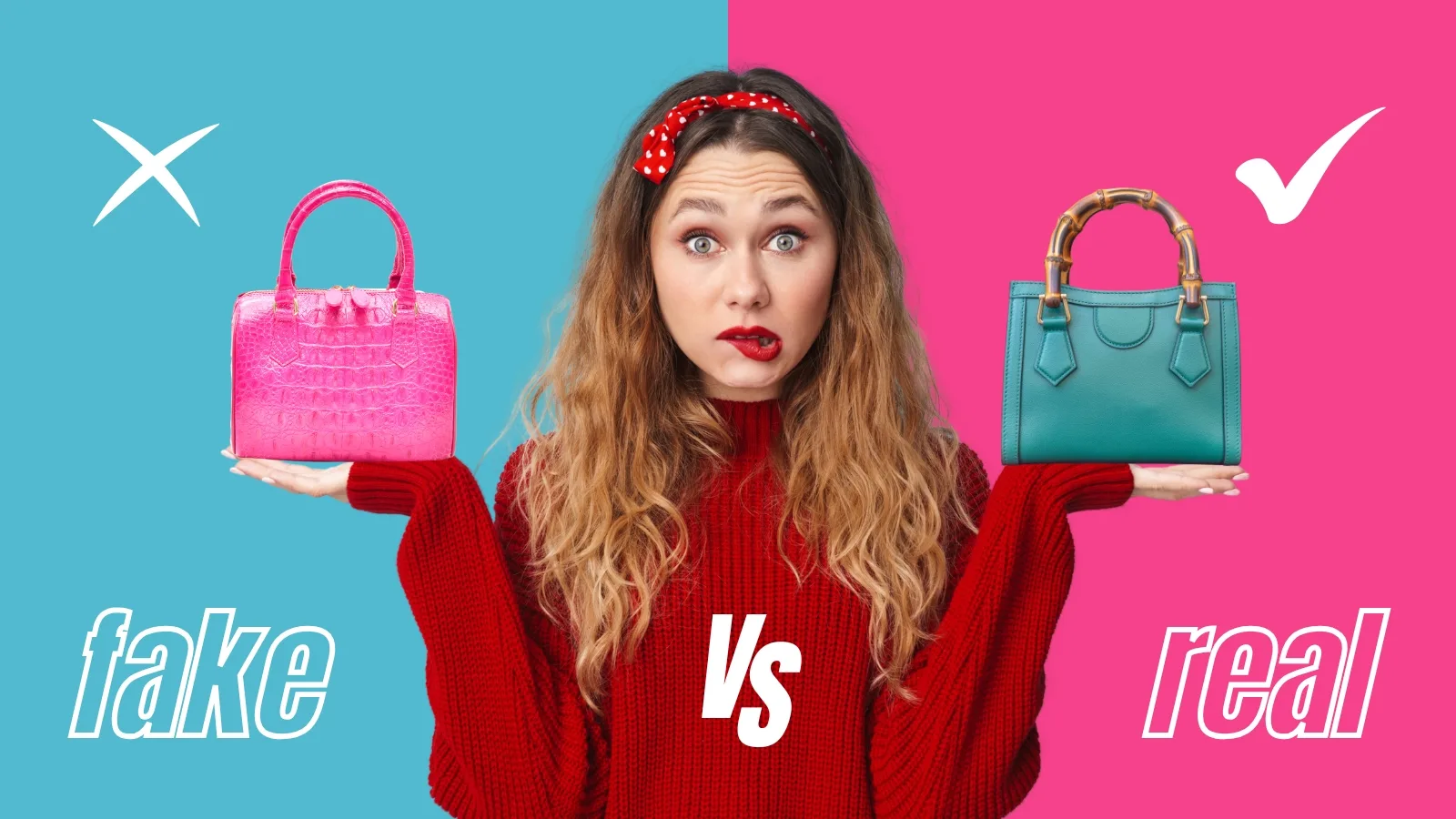
Finance, tech, and productivity channels use this format because their audience is actively making decisions and responds strongly to anything that promises to simplify that process.
9. Giant vs. Tiny
Exaggerated scale contrast creates a sense of awe that is difficult to achieve through any other compositional technique. Placing a small object next to a dramatically oversized version of itself, or a person next to something impossibly large, triggers curiosity about the context behind the visual. It is one of the most effective gaming thumbnail ideas formats because it translates naturally to power comparisons, boss reveals, and challenge content.
10. The Winner Circle
Highlighting one item in a group using a red circle, a glow effect, or an arrow directs the viewer's attention to a specific element while implying that the surrounding items were evaluated and rejected. That implication of a ranking or verdict creates the curiosity gap that drives the click. The viewer wants to know why that one was chosen and whether their own choice would match.
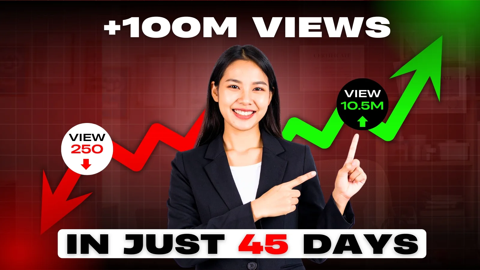
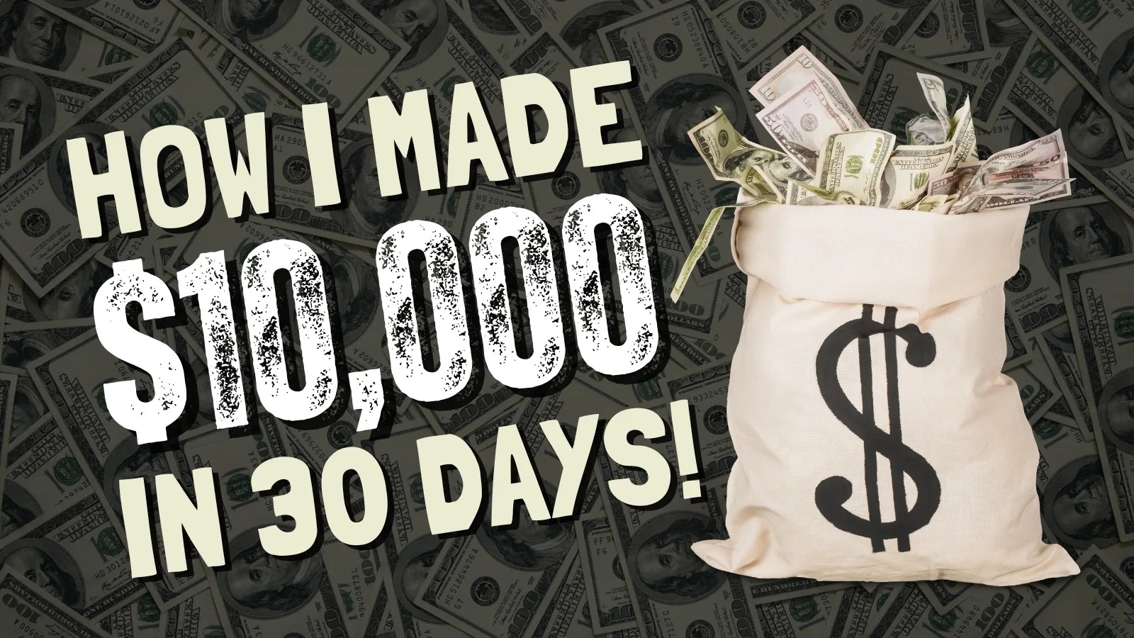
The Numbers and Data Framework
Numbers stop the scroll in a way that abstract promises cannot. A specific figure communicates proof before the viewer has processed any other element of the thumbnail. It implies that the creator has documented evidence, not just an opinion, and that specificity is what separates a credible thumbnail from a generic one.
The psychological driver is precision bias. A viewer encountering "$11,437 in 30 days" processes that as a real result. The same viewer encountering "Make Money Fast" processes it as a claim. Specificity signals authenticity, and authenticity drives clicks in a feed full of vague promises.
11. The Big Stat
A single dominant number placed at large scale against a high-contrast background is one of the strongest YouTube thumbnail design tips for finance, marketing, and business channels. The number does not need explanation on the thumbnail. The title provides the context. The thumbnail's job is to make the viewer ask how.
12. The Dollar Figure
Actual earnings, savings, or cost figures work because money is universally legible. "$0 to $10K" communicates a transformation and a scale simultaneously. The viewer does not need niche knowledge to understand the stakes, which makes dollar figure thumbnails effective across a wider audience than almost any other format.
13. The Percentage Gain or Loss
Percentage figures trigger both aspiration and loss aversion depending on the framing. "Up 340%" triggers aspiration. "Lost 60% of my audience" triggers empathy and curiosity simultaneously. Both emotions drive clicks, making percentage-based thumbnails among the most versatile ideas for YouTube thumbnail formats available across educational and personal brand channels.
The Social Proof Framework
Social proof is one of the most powerful psychological triggers in consumer behavior, and it translates directly into thumbnail performance. When a viewer sees evidence that other people have already validated something, the decision to click becomes significantly easier. The brain interprets crowd behavior as a reliable shortcut for determining value.
The core principle is simple. A creator claiming their method works is a claim. A thumbnail showing 50,000 people in a comment section, a leaderboard position, or a community reaction is evidence. Evidence converts faster than claims across every niche and audience type.
14. The Crowd Reaction Shot
Showing a genuine audience response, a packed room, a viral comment screenshot, or a montage of viewer reactions, implies scale and validation simultaneously. It signals that the content already has an audience and that joining that audience is the correct decision.

These are among the strongest first YouTube video thumbnail ideas for creators launching a new channel who want to signal credibility before they have built it organically.
15. The Leaderboard Position
Placing a visible ranking, a number one badge, a top result screenshot, or a chart position, in the thumbnail communicates competitive validation without requiring the viewer to take the creator's word for it. The leaderboard does the credibility work.
16. The Comment or Testimonial Overlay
A single powerful viewer comment overlaid on the thumbnail creates social proof at the most specific level possible. One real person's reaction is more persuasive than any claim the creator could make about their own content, and it gives the prospective viewer a concrete preview of the emotional experience the video delivers.
The Mystery and Reveal Framework
Unanswered questions are psychologically uncomfortable. The brain has a hardwired drive to resolve incomplete information, and a thumbnail that deliberately withholds the answer to a visible question exploits that drive directly.
The Mystery and Reveal framework is built entirely around that discomfort, and it is one of the most effective curiosity gap thumbnails formats available across every content category.
The difference between mystery and clickbait is whether the video delivers the answer. A blurred result that the video reveals is a legitimate curiosity gap. A blurred result that leads to unrelated content is deception, and the retention data will reflect that within the first 48 hours.
17. The Blurred Object
Pixelating or obscuring the key element in a thumbnail forces the viewer to click to see what it is. The technique works because the brain cannot ignore incomplete visual information. It registers the blur as a question that demands resolution.

Finance, tech, and vlog thumbnail ideas all apply this format effectively by obscuring a result, a product, or a reveal that the title only partially explains.
18. The Hidden Result
Showing a reaction to something the viewer cannot see creates a second layer of mystery. A face expressing genuine shock at something outside the frame raises an immediate question about what caused that reaction. The viewer clicks to find out what the subject is looking at, making the off-frame element as powerful as anything shown directly.
19. The Partial Reveal
Showing enough of a result to confirm something significant happened without showing the full picture is the most sophisticated variation of this framework. A corner of a bank statement, a partially visible product, or a cropped before-and-after communicates that the payoff exists while withholding enough to make clicking the only way to access it fully.
The Color Psychology Framework
Color is not a finishing touch in YouTube thumbnail design tips. It is a strategic decision that determines whether a thumbnail registers as urgent, aspirational, trustworthy, or exciting before the viewer processes a single word of text. Different colors trigger different emotional states, and those emotional states influence the click decision at a subconscious level.
The practical challenge is that YouTube's interface competes directly with your thumbnail. White backgrounds disappear into light mode. Dark gray backgrounds dissolve into dark mode. Every color choice needs to be evaluated against the interface it will sit inside, not against the design software it was built in.
20. High-Energy Colors
Red, orange, and bright yellow trigger urgency and excitement. They are the highest-contrast colors against YouTube's interface across both light and dark mode, which is why they dominate the feed in finance, gaming, and news content. Used as backgrounds or accent colors, they force the eye to stop before the brain decides whether to engage.
21. Trust and Authority Colors
Deep blue and navy signal credibility and expertise. They are the dominant colors in finance, technology, and educational content for a reason. Paired with white text they produce one of the strongest contrast combinations available while simultaneously communicating that the creator is a reliable source rather than an entertainer.
22. Complementary Color Pairings
The highest-performing thumbnail color combinations use complementary pairs that sit opposite each other on the color wheel. Blue and orange. Yellow and purple. Red and green. These pairings create maximum visual contrast without requiring exaggerated saturation, and they perform consistently across both mobile and desktop displays.
Pro Tip: Increase saturation by 15 to 20 percent and sharpness by 10 percent on any export before uploading. Mobile screens compress both qualities, and what looks vivid on a monitor often looks flat in the feed.
Niche-Specific Thumbnail Strategies
The frameworks covered in this guide apply universally, but execution varies significantly by niche. The audience expectation, the competitive visual landscape, and the type of emotional trigger that converts differ across content categories. These niche-specific applications translate the psychology into concrete YouTube thumbnail ideas for the four highest-traffic content categories on the platform.
Gaming
Do:
- Use POV perspectives that put the viewer inside the action
- Show monster or boss reveals with exaggerated scale contrast
- Use high-saturation colors against dark backgrounds to match the visual language of the genre
- Incorporate character expressions with maximum emotional intensity
Don't:
- Use generic controller or console imagery that blends into hundreds of identical gaming thumbnail ideas
- Place critical text over busy background scenes where it disappears at mobile scale
- Rely on in-game screenshots without post-production contrast and sharpness adjustments
Finance
Do:
- Lead with specific dollar figures or percentage gains at dominant scale
- Use bank statement or dashboard screenshots as proof elements
- Pair a data visual with a high-arousal facial expression to combine credibility with emotion
Don't:
- Use stock imagery of money, coins, or generic wealth symbols
- Make claims without visual evidence to support them
- Use low-contrast color combinations that read as untrustworthy at small scale
Cooking
Do:
- Lead with cross-section shots that reveal texture, layers, and color simultaneously
- Add post-production steam effects to finished dishes to trigger sensory anticipation
- Use the Transformation framework with raw ingredients on the left and finished dish on the right
Don't:
- Show overhead flat lay shots that compress poorly at mobile scale
- Use cluttered backgrounds that compete with the food for visual attention
- Neglect color correction since food thumbnails live and die on saturation
Tech and Coding
Do:
- Use the Clean vs. Messy code format to trigger the improvement instinct
- Lead with a "Don't Buy This" warning frame for review content to trigger loss aversion
- Show before and after interface comparisons with clear visual contrast between the two states
Don't:
- Use generic laptop or smartphone stock imagery that carries no specific visual promise
- Overcrowd the thumbnail with multiple screens or code blocks that become unreadable at thumbnail scale
- Ignore the emotional layer since even technical content converts better with a human face anchoring the design
Great Thumbnails Are Engineered
A high-performing thumbnail is not a lucky creative decision. It is the deliberate application of a psychological framework to a specific audience at a specific moment in their scroll. The seven frameworks in this guide are not templates. They are strategic tools, and the creators who use them consistently outperform those who rely on instinct alone.
The most important shift is treating every thumbnail as a testable hypothesis rather than a finished product. Design against a framework. Run it through Thumbnail IQ to benchmark it against the top performers in your niche. Test two variations using YouTube's native Test and Compare feature. Let the data decide.
Best YouTube thumbnail ideas are not discovered once and repeated forever. They are refined continuously based on what the audience clicks. Consistency in branding matters. Consistency in framework matters more. The thumbnail gets the click. The content keeps the viewer. Both have to deliver on the same promise for the system to compound into sustainable channel growth.