Click-through rate is the metric that determines whether YouTube's algorithm promotes your video or buries it. It is calculated before a single person watches a single second of your content, based entirely on one thing: whether your thumbnail earns the click.
Creators who struggle with low CTR despite strong content almost always have the same problem. Their thumbnails are technically acceptable but psychologically invisible. They blend into the feed rather than interrupting it, and on a platform where a viewer makes a scroll-or-click decision in under three seconds, blending in is the same as not showing up.
A great YouTube thumbnail maker gives you the tools to build something better. But the tool is only as effective as the design principles behind it, and those principles are what separate thumbnails that convert from thumbnails that get ignored.
Master the Technical Specifications (The Non-Negotiables)
Before any design principle matters, the technical foundation has to be correct. A thumbnail built on wrong YouTube thumbnail dimensions gets stretched, compressed, or rejected entirely, and no amount of strong design recovers a pixelated or letterboxed image once it is live on the channel.
Core specs every creator needs to know:
- Recommended YouTube thumbnail size: 1280 x 720 pixels
- Minimum width: 640 pixels
- Required YouTube thumbnail aspect ratio: 16:9
- Accepted file formats: .JPG, .PNG, or static .GIF
- Maximum file size: 2MB
The 16:9 YouTube thumbnail aspect ratio is non-negotiable. Any image uploaded outside this ratio gets black bars added automatically, which signals poor production quality to every viewer who encounters it in search results or the suggested feed.
The 1280 x 720 YouTube thumbnail size is the practical gold standard. It renders sharply across desktop, mobile, tablet, and connected TV without pushing file sizes toward the 2MB ceiling. Uploading at higher resolutions like 1920 x 1080 is possible but requires careful compression to stay within the limit without degrading visual quality.
Warning: The 2MB file size limit is a hard ceiling with no exceptions. YouTube rejects any file that exceeds it regardless of design quality. If your PNG file is too large, run it through a free compressor like Squoosh or TinyPNG before uploading. For JPG files, exporting at 85 to 90 percent quality in any design tool keeps the image sharp and well within the limit.
Getting these specs right is the entry fee. Every YouTube thumbnail creator tool worth using, from Canva to Adobe Express to YTGrowth's Thumbnail IQ, is built around these exact dimensions. The design work that drives clicks happens on top of this foundation, not instead of it.
Apply the '3-Second Rule' of Visual Hierarchy
A viewer scrolling through YouTube search results or their home feed spends under three seconds deciding whether to click on any given thumbnail. That decision is not conscious or analytical.
It is instinctive, driven entirely by whether the visual immediately registers as relevant, interesting, or emotionally compelling. Designing a thumbnail that wins that decision requires understanding how the human eye scans a visual before the brain catches up.
70 percent of YouTube views happen on mobile devices, which means every design choice needs to pass the mobile test before it passes anything else. If a thumbnail does not read clearly at the size of a postage stamp, it does not read clearly where the majority of your audience will encounter it.
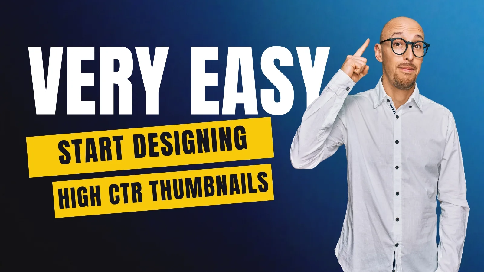
Color and Contrast
YouTube's interface is predominantly white in light mode and dark gray in dark mode. High contrast colors like orange, lime green, and yellow naturally interrupt that background and stop the scroll. Low contrast colors like white, light gray, and pastels dissolve into the interface and disappear entirely.
Avoid white and light gray backgrounds. They reduce visibility across both interface modes and make your thumbnail invisible in exactly the placements that drive the most clicks.
Composition and the Rule of Thirds
Dividing the thumbnail canvas into a 3x3 grid creates six natural intersection points where the human eye gravitates first. Placing the primary visual element at one of those intersections rather than dead center produces a dynamic composition that reads faster and holds attention longer at thumbnail scale. Directional cues like a red arrow or a circle drawn around the focal point create an additional visual anchor that guides the eye exactly where the design intends.
Text and Typography
Text on a thumbnail should never exceed three to five words. Any more and the message cannot be absorbed in the three seconds available. Bold sans-serif fonts like Impact or Bebas Neue at a large enough size to read on a phone screen are the baseline standard.
White and light gray backgrounds behind text reduce contrast and make the words harder to read across both light and dark interface modes, so high contrast pairings like white text on dark backgrounds or black text on yellow backgrounds consistently outperform low contrast alternatives across every device type.
Engineer the Curiosity Gap (Psychology Over Pixels)
Technical specs get your thumbnail accepted. Visual hierarchy gets it noticed. The curiosity gap is what gets it clicked. It is the psychological tension created when a thumbnail raises a question that only watching the video can answer, and it is the single biggest differentiator between thumbnails that convert and thumbnails that get scrolled past.
The curiosity gap works because the human brain is wired to resolve incomplete information. A thumbnail that shows a surprising outcome, an unexpected contrast, or an unresolved visual story creates a mental itch that the viewer can only scratch by clicking play.
The Complement vs. Repeat Rule
The most common mistake creators make when they make YouTube thumbnails is replicating the video title in the thumbnail text. The title and thumbnail should work as a duo, each carrying different information. The title provides context. The thumbnail provides the emotional hook that makes that context irresistible.
| Do | Don't |
|---|---|
| Show a surprising result that the title explains | Repeat the exact title text on the thumbnail |
| Use a close-up face with exaggerated emotion | Use a neutral or flat facial expression |
| Show a 'before' state that implies transformation | Use generic stock imagery with no narrative |
| Keep eyes sharp, visible, and directed at the viewer | Obscure or crop out the subject's eyes |
| Create visual tension that demands resolution | Design a thumbnail that tells the whole story |
The Power of the Human Face
Humans are hardwired to look at faces before anything else in a visual composition. A close-up face expressing surprise, intensity, or focus draws the eye faster than any graphic element. The eyes specifically are the anchor point.
Sharp, clearly visible eyes directed toward the viewer create an immediate human connection that generic thumbnails built around text and graphics simply cannot replicate.
Visual Storytelling
Showing a broken object, a dramatic before state, or a transformed result implies a narrative without explaining it. That implication is what triggers curiosity. A thumbnail showing a cracked phone screen next to a title about phone security does not need words to communicate stakes. The visual does the work, and the viewer clicks to resolve the story.
Choose Your Tools (From AI to Professional Suites)
The right YouTube thumbnail maker depends entirely on where you are in your creative workflow and how much time you want to spend in the design process. These three tiers cover every skill level from complete beginner to professional designer.
Beginner: Template-Based Creation
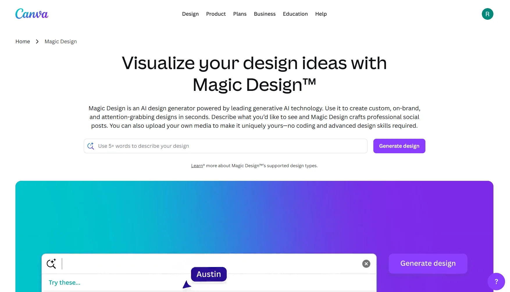
Canva and Adobe Express are the fastest entry points for any creator who needs to make YouTube thumbnails without a steep learning curve. Both offer YouTube-specific presets that automatically set the canvas to the correct YouTube thumbnail dimensions, removing the technical setup entirely.
Canva's Magic Studio adds AI-assisted background removal, which is useful for isolating faces and subjects against custom backgrounds without manual masking. Adobe Express offers similar functionality with tight integration into the broader Adobe ecosystem for creators already using those tools.
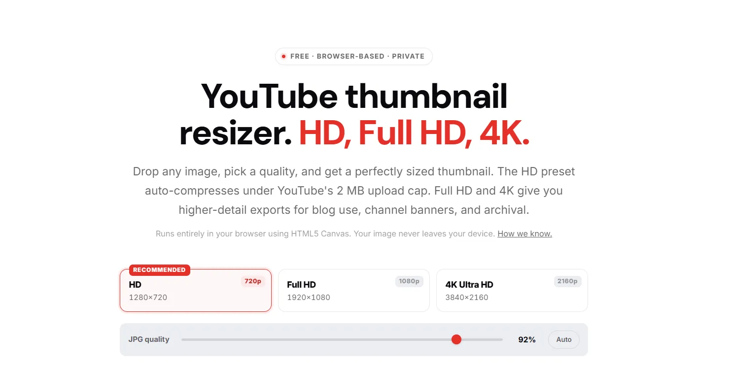
For getting the dimensions right before designing, YTGrowth's free Thumbnail Resizer handles HD, Full HD, and 4K exports in one click, runs entirely in the browser, and auto-compresses under the 2MB cap on the HD preset automatically.
Resize any image to perfect YouTube specs in secondsThe free Thumbnail Resizer crops and exports to 1280 x 720 in the browser, no signup, no install. Drop the file in, download the upload-ready version.Try the resizer →Intermediate: AI-Assisted Design
Midjourney and DALL-E 3 are useful for generating unique background textures, illustrated scenes, and visual concepts that stock photo libraries cannot provide. Pairing AI-generated backgrounds with custom typography and real face photography produces thumbnails that look genuinely original rather than template-based.
This tier works best for creators who have a clear visual concept but lack the photography resources to execute it from scratch.
Pro: Pixel-Perfect Precision
Adobe Photoshop and Figma give experienced designers full control over every layer, mask, and export setting. Both tools are overkill for most beginners but become valuable as a channel scales and thumbnail consistency across hundreds of videos becomes a brand asset.
Before uploading any thumbnail regardless of which tool produced it, preview it at reduced size using ThumbsUp.tv, which renders your design across desktop, mobile, and TV displays simultaneously so you can catch readability issues before they cost you clicks.
Once the design is live, benchmark it against the top performers in your niche to see how your packaging stacks up before you ever hit publish.
Test, Compare, and Optimize for the Algorithm
A well-designed thumbnail is a hypothesis. Testing is how you confirm whether it works. A 1% increase in CTR can generate thousands of additional views through YouTube's recommendation algorithm, which makes thumbnail testing one of the highest-return optimization activities available to any creator at any stage of growth.
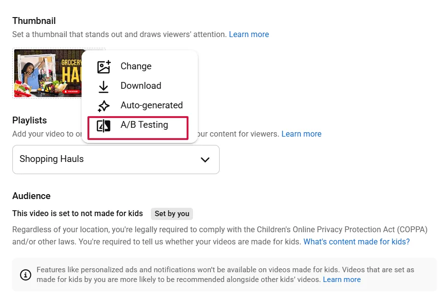
How to use YouTube's native Test and Compare feature
- Open YouTube Studio and navigate to the video you want to test.
- Click on the video and select the Details tab.
- Scroll to the Thumbnail section and select Test and Compare.
- Upload two or three thumbnail variations to run against each other.
- YouTube distributes impressions across the variations automatically and reports which version earns the highest CTR over time.
- Select the winning thumbnail and apply it permanently once the data is statistically clear.
Pro Tip: A 1% increase in CTR can result in thousands of additional views through the recommendation algorithm. On a video already receiving strong impressions, that single percentage point compounds into a meaningful difference in total reach within days.
CTR and Average View Duration work together as a paired signal. A thumbnail that earns clicks but triggers immediate drop-offs tells the algorithm the content did not deliver on its visual promise. The goal is a thumbnail that attracts the right viewer, not just the most viewers.
If a video is underperforming in the first 24 to 48 hours, the thumbnail is the first variable to change. Upload a new variation through the Test and Compare feature rather than replacing the original outright, so the data comparison remains intact.
For a deeper read on whether your thumbnail is competitive before you even run a test, study the thumbnails winning in your niche on contrast, face presence, text density, and curiosity gap signals, giving you a data-backed visual bar to clear before the first impression is ever served.
The Clickbait Trap: Why Honesty Protects Your Channel
Curiosity and deception are not the same thing. A thumbnail that creates genuine intrigue around real content drives clicks and watch time simultaneously. A thumbnail that overpromises or misrepresents what the video delivers earns the click and immediately loses the viewer, which is algorithmically worse than never earning the click at all.
A misleading thumbnail triggers early drop-offs. Early drop-offs destroy Average View Duration. Low AVD tells the algorithm the content failed to deliver, and the algorithm responds by pulling back distribution on that video and eventually on the channel as a whole. The 2026 YouTube SEO blueprint covers the CTR and retention thresholds the algorithm rewards once your packaging is honest.
Three consequences no creator should accept:
- Retention collapse. Viewers who feel deceived leave within the first 30 seconds, dragging AVD down to a level that signals low quality to the algorithm regardless of how good the actual content is.
- Community Guidelines risk. YouTube explicitly prohibits thumbnails that mislead viewers about the content of a video. Repeated violations result in strikes, demonetization, or channel termination.
- Audience trust erosion. A viewer who clicks based on a misleading thumbnail and bounces will not click again. That lost trust compounds across every future video the channel publishes.
The standard every free thumbnail maker and design tool should be held to is simple. The thumbnail raises a question. The video answers it honestly. Curiosity is the gap between those two things. Deception is when the video never had the answer to begin with.
Intentional Beats Beautiful
A high-performing thumbnail is not the most beautiful one in the feed. It is the most intentional one. Every decision from YouTube thumbnail size and file format to contrast, composition, and curiosity gap exists to serve a single outcome: earning the click from the right viewer at the right moment.
The technical foundation keeps your thumbnail compliant. The 3-Second Rule makes it visible. The curiosity gap makes it irresistible. Testing confirms whether it works. None of those layers function independently, and skipping any one of them leaves clicks on the table that a more deliberate creator will earn instead. The YouTube thumbnail size guide goes deeper on the technical specs and safe zones referenced here.
Start with the correct YouTube thumbnail dimensions using YTGrowth's free Thumbnail Resizer, build around mobile-first design principles, and treat every upload as an opportunity to close the distance between where your packaging is now and where your click-through rate needs to be.